この記事では、React初心者向けにMaterial UI のコンポーネントを使用してメニュー画面を実装する方法をTypescript版で紹介します。
読者に下記のメリットが得られることを目的として作成しています。
- Reactでメニュー画面の実装方法がわかる
- Drawerコンポーネントの使い方がわかる
create-react-app でサンプルアプリを作成
アプリのプロジェクトフォルダを作りたい場所で、下記のコマンドを実行してください。
※Node.jsをインストールしていない方は、Node.jsのインストールから始めましょう。
https://tako-xyz.com/nodejs-install-windows/
npx create-react-app sample_menu --template typescript
cd sample_menu
sample_menu のフォルダが作成されてそこに移動できればOKです。
デフォルトだと、アプリ起動時に下記のエラーが出てしまいます。
TSでは、型定義がない変数はany型になりますが、それを書き方として禁止してるそうなので、そのチェックのエラーが出ます。
Could not find a declaration file for module 'react'
筆者環境では、バージョンを上げると解消されました。下記のコマンドを実行しましょう。
npm install --save typescript @types/node @types/react @types/react-dom @types/jest
Material UI パッケージのインストール
手軽にマテリアルUIの画面を実装するために Material-UI のパッケージが必要になります。
下記のコマンドを実行してください。
npm install @material-ui/core @material-ui/icons
Material UI のサンプルで画面作成
Material UIのサイトから Drawer コンポーネントのサンプルコードを入手しましょう。
https://material-ui.com/components/drawers/#persistent-drawer
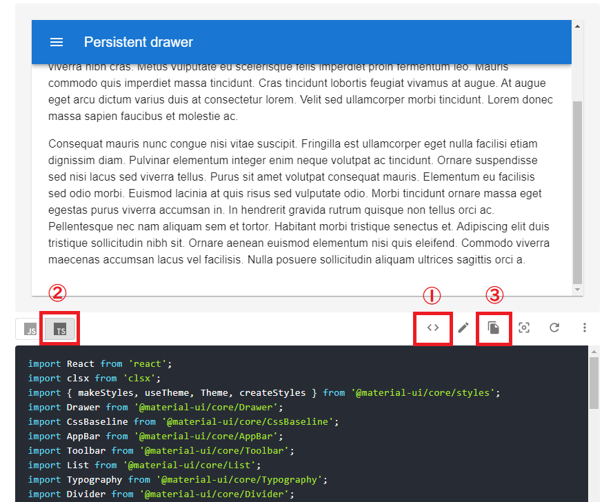
- <> をクリックすれば、コードが表示されます。
- Typescriptで実装したいので、「TS」をクリックしてソースを切り替えます。
- コピーのアイコンをクリックすればコピーできます。
src フォルダの直下に「PersistentDrawerLeft.tsx」を作り、サンプルコードをペーストしましょう。
次に「App.tsx」を開いて、作成した「PersistentDrawerLeft」コンポーネントを配置しましょう。
App.tsx
import React from "react";
import PersistentDrawerLeft from "./PersistentDrawerLeft";

function App() {
  return <PersistentDrawerLeft />;
}

export default App;
アプリを起動して画面を確認してみましょう。
npm start
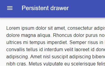
これだけで目的の画面はもうできあがっていますね。
ただ、これだけではメニューのリンクをクリックして、指定のページを表示させることができないのでおもしろくありません。
動作させるように修正しましょう。
react-router-dom のインストール
画面遷移を実装するために react-router-dom というパッケージが必要になります。下記のコマンドを実行してください。
5分ぐらいかかるので、動画でも見て休憩しましょう。
npm install react-router-dom
npm install --save-dev @types/react-router-dom
表示画面作成
まず、メニューのリンクをクリックしたときに表示する画面を作成しましょう。
「Starred」リンクをクリックしたときのコンポーネントを作成します。
先に先ほど作成した「PersistentDrawerLeft.tsx」を2か所修正しましょう。
import { Link } from "react-router-dom";
1点目は、Link コンポーネントをインポートします。
<List>
  {["Inbox", "Starred", "Send email", "Drafts"].map((text, index) => (
    <Link to={"/" + text}>
      <ListItem button key={text}>
        <ListItemIcon>
          {index % 2 === 0 ? <InboxIcon /> : <MailIcon />}
        </ListItemIcon>
        <ListItemText primary={text} />
      </ListItem>
    </Link>
  ))}
</List>
2点目は、メニューのリストを Link コンポーネントで挟みましょう。
to に指定するパスは、リンク名を活用したものにします。
修正した「PersistentDrawerLeft.tsx」コピー&リネームして、「Starred.tsx」を作成しましょう。

「Starred.tsx」は、メニューの「Starred」リンクをクリックしたときのコンポーネントとして使います。
中身の表示内容の部分だけ修正しましょう。
<main
  className={clsx(classes.content, {
    [classes.contentShift]: open,
  })}
>
  <div className={classes.drawerHeader} />
  <Typography paragraph>Starred!!</Typography>
</main>
「Starred!!」の文字が表示されるだけのものにします。
一応、修正後のファイルを下記に置いておきます。
PersistentDrawerLeft.tsx
import React from "react";
import clsx from "clsx";
import {
  makeStyles,
  useTheme,
  Theme,
  createStyles,
} from "@material-ui/core/styles";
import Drawer from "@material-ui/core/Drawer";
import CssBaseline from "@material-ui/core/CssBaseline";
import AppBar from "@material-ui/core/AppBar";
import Toolbar from "@material-ui/core/Toolbar";
import List from "@material-ui/core/List";
import Typography from "@material-ui/core/Typography";
import Divider from "@material-ui/core/Divider";
import IconButton from "@material-ui/core/IconButton";
import MenuIcon from "@material-ui/icons/Menu";
import ChevronLeftIcon from "@material-ui/icons/ChevronLeft";
import ChevronRightIcon from "@material-ui/icons/ChevronRight";
import ListItem from "@material-ui/core/ListItem";
import ListItemIcon from "@material-ui/core/ListItemIcon";
import ListItemText from "@material-ui/core/ListItemText";
import InboxIcon from "@material-ui/icons/MoveToInbox";
import MailIcon from "@material-ui/icons/Mail";

const drawerWidth = 240;

const useStyles = makeStyles((theme: Theme) =>
  createStyles({
    root: {
      display: "flex",
    },
    appBar: {
      transition: theme.transitions.create(["margin", "width"], {
        easing: theme.transitions.easing.sharp,
        duration: theme.transitions.duration.leavingScreen,
      }),
    },
    appBarShift: {
      width: `calc(100% - ${drawerWidth}px)`,
      marginLeft: drawerWidth,
      transition: theme.transitions.create(["margin", "width"], {
        easing: theme.transitions.easing.easeOut,
        duration: theme.transitions.duration.enteringScreen,
      }),
    },
    menuButton: {
      marginRight: theme.spacing(2),
    },
    hide: {
      display: "none",
    },
    drawer: {
      width: drawerWidth,
      flexShrink: 0,
    },
    drawerPaper: {
      width: drawerWidth,
    },
    drawerHeader: {
      display: "flex",
      alignItems: "center",
      padding: theme.spacing(0, 1),
      // necessary for content to be below app bar
      ...theme.mixins.toolbar,
      justifyContent: "flex-end",
    },
    content: {
      flexGrow: 1,
      padding: theme.spacing(3),
      transition: theme.transitions.create("margin", {
        easing: theme.transitions.easing.sharp,
        duration: theme.transitions.duration.leavingScreen,
      }),
      marginLeft: -drawerWidth,
    },
    contentShift: {
      transition: theme.transitions.create("margin", {
        easing: theme.transitions.easing.easeOut,
        duration: theme.transitions.duration.enteringScreen,
      }),
      marginLeft: 0,
    },
  })
);

export default function PersistentDrawerLeft() {
  const classes = useStyles();
  const theme = useTheme();
  const [open, setOpen] = React.useState(false);

  const handleDrawerOpen = () => {
    setOpen(true);
  };

  const handleDrawerClose = () => {
    setOpen(false);
  };

  return (
    <div className={classes.root}>
      <CssBaseline />
      <AppBar
        position="fixed"
        className={clsx(classes.appBar, {
          [classes.appBarShift]: open,
        })}
      >
        <Toolbar>
          <IconButton
            color="inherit"
            aria-label="open drawer"
            onClick={handleDrawerOpen}
            edge="start"
            className={clsx(classes.menuButton, open && classes.hide)}
          >
            <MenuIcon />
          </IconButton>
          <Typography variant="h6" noWrap>
            Persistent drawer
          </Typography>
        </Toolbar>
      </AppBar>
      <Drawer
        className={classes.drawer}
        variant="persistent"
        anchor="left"
        open={open}
        classes={{
          paper: classes.drawerPaper,
        }}
      >
        <div className={classes.drawerHeader}>
          <IconButton onClick={handleDrawerClose}>
            {theme.direction === "ltr" ? (
              <ChevronLeftIcon />
            ) : (
              <ChevronRightIcon />
            )}
          </IconButton>
        </div>
        <Divider />
        <List>
          {["Inbox", "Starred", "Send email", "Drafts"].map((text, index) => (
            <ListItem button key={text}>
              <ListItemIcon>
                {index % 2 === 0 ? <InboxIcon /> : <MailIcon />}
              </ListItemIcon>
              <ListItemText primary={text} />
            </ListItem>
          ))}
        </List>
        <Divider />
        <List>
          {["All mail", "Trash", "Spam"].map((text, index) => (
            <ListItem button key={text}>
              <ListItemIcon>
                {index % 2 === 0 ? <InboxIcon /> : <MailIcon />}
              </ListItemIcon>
              <ListItemText primary={text} />
            </ListItem>
          ))}
        </List>
      </Drawer>
      <main
        className={clsx(classes.content, {
          [classes.contentShift]: open,
        })}
      >
        <div className={classes.drawerHeader} />
        <Typography paragraph>
          Lorem ipsum dolor sit amet, consectetur adipiscing elit, sed do
          eiusmod tempor incididunt ut labore et dolore magna aliqua. Rhoncus
          dolor purus non enim praesent elementum facilisis leo vel. Risus at
          ultrices mi tempus imperdiet. Semper risus in hendrerit gravida rutrum
          quisque non tellus. Convallis convallis tellus id interdum velit
          laoreet id donec ultrices. Odio morbi quis commodo odio aenean sed
          adipiscing. Amet nisl suscipit adipiscing bibendum est ultricies
          integer quis. Cursus euismod quis viverra nibh cras. Metus vulputate
          eu scelerisque felis imperdiet proin fermentum leo. Mauris commodo
          quis imperdiet massa tincidunt. Cras tincidunt lobortis feugiat
          vivamus at augue. At augue eget arcu dictum varius duis at consectetur
          lorem. Velit sed ullamcorper morbi tincidunt. Lorem donec massa sapien
          faucibus et molestie ac.
        </Typography>
        <Typography paragraph>
          Consequat mauris nunc congue nisi vitae suscipit. Fringilla est
          ullamcorper eget nulla facilisi etiam dignissim diam. Pulvinar
          elementum integer enim neque volutpat ac tincidunt. Ornare suspendisse
          sed nisi lacus sed viverra tellus. Purus sit amet volutpat consequat
          mauris. Elementum eu facilisis sed odio morbi. Euismod lacinia at quis
          risus sed vulputate odio. Morbi tincidunt ornare massa eget egestas
          purus viverra accumsan in. In hendrerit gravida rutrum quisque non
          tellus orci ac. Pellentesque nec nam aliquam sem et tortor. Habitant
          morbi tristique senectus et. Adipiscing elit duis tristique
          sollicitudin nibh sit. Ornare aenean euismod elementum nisi quis
          eleifend. Commodo viverra maecenas accumsan lacus vel facilisis. Nulla
          posuere sollicitudin aliquam ultrices sagittis orci a.
        </Typography>
      </main>
    </div>
  );
}
Starred.tsx
import React from "react";
import clsx from "clsx";
import {
  makeStyles,
  useTheme,
  Theme,
  createStyles,
} from "@material-ui/core/styles";
import Drawer from "@material-ui/core/Drawer";
import CssBaseline from "@material-ui/core/CssBaseline";
import AppBar from "@material-ui/core/AppBar";
import Toolbar from "@material-ui/core/Toolbar";
import List from "@material-ui/core/List";
import Typography from "@material-ui/core/Typography";
import Divider from "@material-ui/core/Divider";
import IconButton from "@material-ui/core/IconButton";
import MenuIcon from "@material-ui/icons/Menu";
import ChevronLeftIcon from "@material-ui/icons/ChevronLeft";
import ChevronRightIcon from "@material-ui/icons/ChevronRight";
import ListItem from "@material-ui/core/ListItem";
import ListItemIcon from "@material-ui/core/ListItemIcon";
import ListItemText from "@material-ui/core/ListItemText";
import InboxIcon from "@material-ui/icons/MoveToInbox";
import MailIcon from "@material-ui/icons/Mail";
import { Link } from "react-router-dom";
const drawerWidth = 240;

const useStyles = makeStyles((theme: Theme) =>
  createStyles({
    root: {
      display: "flex",
    },
    appBar: {
      transition: theme.transitions.create(["margin", "width"], {
        easing: theme.transitions.easing.sharp,
        duration: theme.transitions.duration.leavingScreen,
      }),
    },
    appBarShift: {
      width: `calc(100% - ${drawerWidth}px)`,
      marginLeft: drawerWidth,
      transition: theme.transitions.create(["margin", "width"], {
        easing: theme.transitions.easing.easeOut,
        duration: theme.transitions.duration.enteringScreen,
      }),
    },
    menuButton: {
      marginRight: theme.spacing(2),
    },
    hide: {
      display: "none",
    },
    drawer: {
      width: drawerWidth,
      flexShrink: 0,
    },
    drawerPaper: {
      width: drawerWidth,
    },
    drawerHeader: {
      display: "flex",
      alignItems: "center",
      padding: theme.spacing(0, 1),
      // necessary for content to be below app bar
      ...theme.mixins.toolbar,
      justifyContent: "flex-end",
    },
    content: {
      flexGrow: 1,
      padding: theme.spacing(3),
      transition: theme.transitions.create("margin", {
        easing: theme.transitions.easing.sharp,
        duration: theme.transitions.duration.leavingScreen,
      }),
      marginLeft: -drawerWidth,
    },
    contentShift: {
      transition: theme.transitions.create("margin", {
        easing: theme.transitions.easing.easeOut,
        duration: theme.transitions.duration.enteringScreen,
      }),
      marginLeft: 0,
    },
  })
);

export default function Starred() {
  const classes = useStyles();
  const theme = useTheme();
  const [open, setOpen] = React.useState(false);

  const handleDrawerOpen = () => {
    setOpen(true);
  };

  const handleDrawerClose = () => {
    setOpen(false);
  };

  return (
    <div className={classes.root}>
      <CssBaseline />
      <AppBar
        position="fixed"
        className={clsx(classes.appBar, {
          [classes.appBarShift]: open,
        })}
      >
        <Toolbar>
          <IconButton
            color="inherit"
            aria-label="open drawer"
            onClick={handleDrawerOpen}
            edge="start"
            className={clsx(classes.menuButton, open && classes.hide)}
          >
            <MenuIcon />
          </IconButton>
          <Typography variant="h6" noWrap>
            Persistent drawer
          </Typography>
        </Toolbar>
      </AppBar>
      <Drawer
        className={classes.drawer}
        variant="persistent"
        anchor="left"
        open={open}
        classes={{
          paper: classes.drawerPaper,
        }}
      >
        <div className={classes.drawerHeader}>
          <IconButton onClick={handleDrawerClose}>
            {theme.direction === "ltr" ? (
              <ChevronLeftIcon />
            ) : (
              <ChevronRightIcon />
            )}
          </IconButton>
        </div>
        <Divider />
        <List>
          {["Inbox", "Starred", "Send email", "Drafts"].map((text, index) => (
            <Link to={"/" + text}>
              <ListItem button key={text}>
                <ListItemIcon>
                  {index % 2 === 0 ? <InboxIcon /> : <MailIcon />}
                </ListItemIcon>
                <ListItemText primary={text} />
              </ListItem>
            </Link>
          ))}
        </List>
        <Divider />
        <List>
          {["All mail", "Trash", "Spam"].map((text, index) => (
            <ListItem button key={text}>
              <ListItemIcon>
                {index % 2 === 0 ? <InboxIcon /> : <MailIcon />}
              </ListItemIcon>
              <ListItemText primary={text} />
            </ListItem>
          ))}
        </List>
      </Drawer>
      <main
        className={clsx(classes.content, {
          [classes.contentShift]: open,
        })}
      >
        <div className={classes.drawerHeader} />
        <Typography paragraph>Starred!!</Typography>
      </main>
    </div>
  );
}
ルーティングの定義
次に、画面の切り替わりを実現するためにルーティングを定義します。
src/App.tsx を開いて編集しましょう。
App.tsx
import React from "react";
import { BrowserRouter, Redirect, Route, Switch } from "react-router-dom";
import PersistentDrawerLeft from "./PersistentDrawerLeft";
import Starred from "./Starred";

function App() {
  return (
    <BrowserRouter>
      <Switch>
        <Route path="/" exact component={PersistentDrawerLeft} />
        <Route path="/Starred" exact component={Starred} />
        <Redirect to="/" />
      </Switch>
    </BrowserRouter>
  );
}

export default App;
これでメニューリンクをクリックした際に画面が切り替わるようになります。
確認してみましょう。
画面の確認
下記のコマンドでアプリを起動しましょう。
npm start
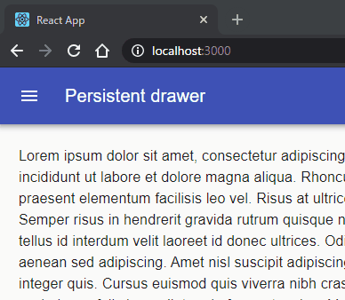
うまく動作すれば上図のように動作します。
できるだけ早く実装するためにコピペで作りましたが、重複する部分は別コンポーネントにすることと、中身で表示するコンポーネントは個別に作った方がいいでしょう。
より良くしたい方はトライしてみましょう。
使用したコンポーネントの説明
最後に、使用したコンポーネントの簡単な説明をします。
AppBar コンポーネント
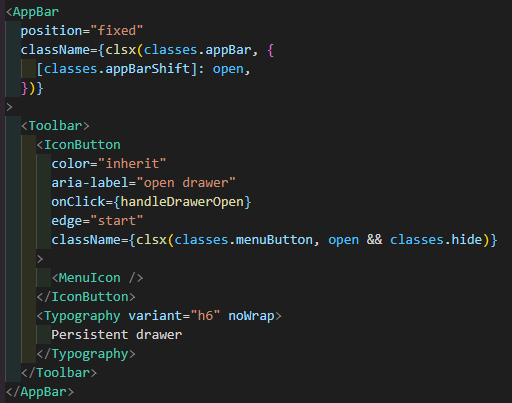
画面上部に表示されてるバーの領域になります。
className で使われている clsx は、クラス名を動的に変更したいときに使うライブラリです。
appBar クラスの適用と open 変数のBooleanに合わせて、appBarShift のクラスを適用してるか決めています。
(open が true なら appBarShift を適用(バーを短くする)、false なら appBarShift を適用しない)
<AppBar> の中では、<Toobar> を置いて使うようです。
アイコンをボタンとして使うために、<IconButton> でアイコンのコンポーネント(<MenuIcon>)を挟んでいます。
<Typograpy>は、テキストを任意の形式で表示する際のコンポーネントで、バーの表示名で使われています。
Drawer コンポーネント
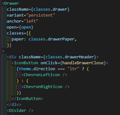
左側に表示するメニューの領域になります。
この中でメニューの中身を定義しています。
(メニューを閉じるアイコン、区切り線、メニューのリスト)
<Drawer>コンポーネントでは、下記の属性を使用しています。
- variant:ユーザが操作するまでメニューの表示を永続させる場合、persistentを指定するようです
- anchor :メニューの表示位置を指定します
- open:開く開かないのフラグの変数を指定します
紹介は以上になります。
閲覧ありがとうございました。
参考サイト: